A vertical signature.
The full wordmark follows the length of the bottle.
Exploring how an established identity lives beyond the logo—on apparel, everyday objects and event materials.
The assignment was to extend an established identity into physical promotional materials. I personally developed concepts and apparel print artwork, adapting the brand to garment templates, product surfaces and larger event formats, with artwork and print-production coordination. This selection distinguishes working concepts from artwork applications.
I developed concepts and apparel print artwork, with artwork and print-production coordination for promotional materials.
Adapt scale, placement and contrast to each garment, product and event format while keeping the established identity consistent.
Apparel concepts, placement studies and promotional applications. Working concepts and artwork mockups are identified in their captions.
Concept work creates room to explore proportion and placement before a design is committed to a specific application. The jersey study uses the leaf as a primary graphic; the rug studies test different relationships between the symbol, wordmark and circular format.
Concept sheets are shown as working artwork, including the garment template and layout notes. Select an image to inspect the original.
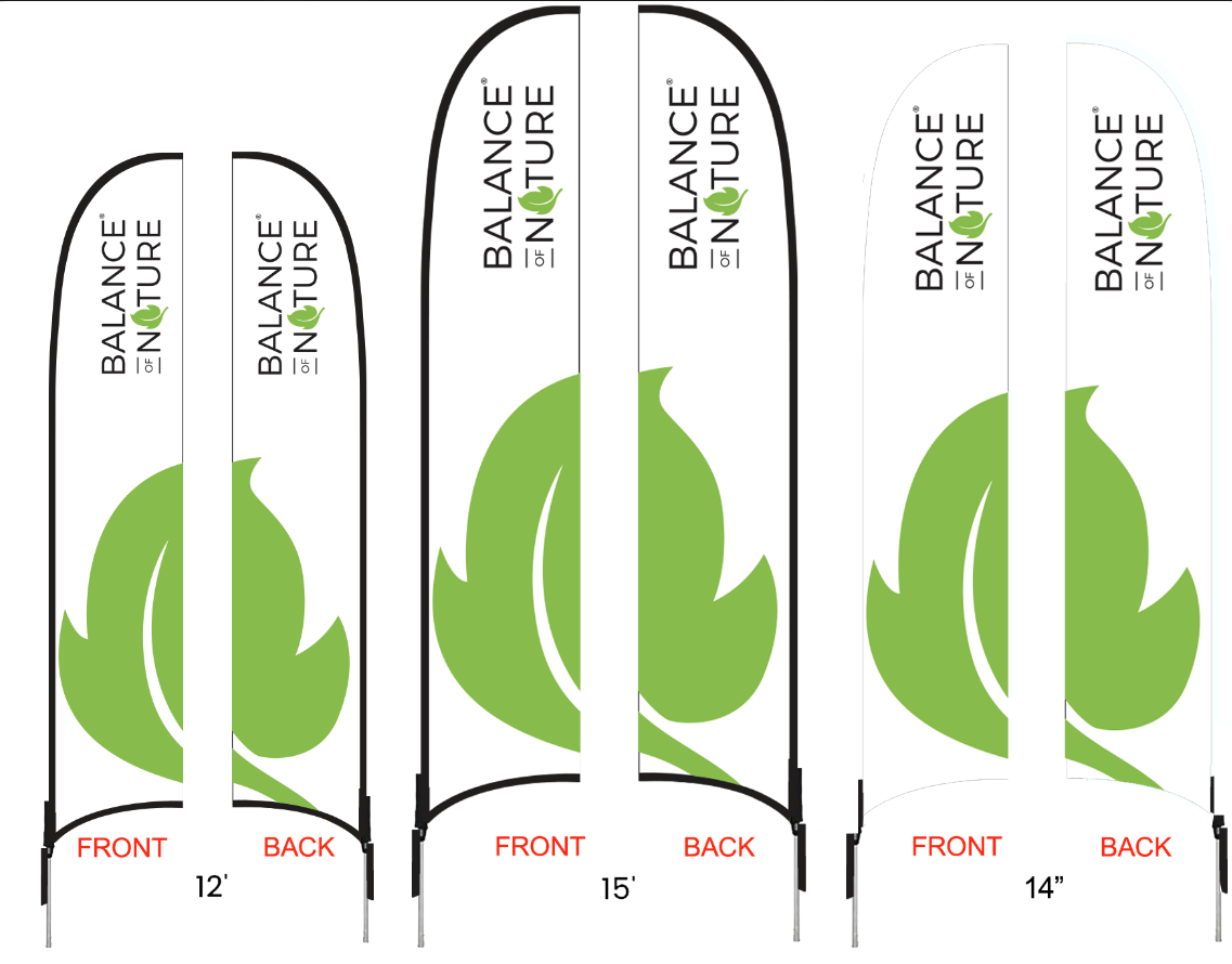
The feather-flag study brings the wordmark and an oversized leaf into a tall format, with front and back artwork shown together.
Different products call for different placements. On dark fabric, the white wordmark and green leaf form a compact signature. On drinkware and smaller pieces, the symbol and wordmark can take on different proportions.
The full wordmark follows the length of the bottle.
The leaf becomes the focal point on a bright green surface.
A supporting selection of merchandise artwork.
Event applications place the identity into a larger setting. The arch and table-cover artwork show two different scales: one creates a frame, while the other brings the wordmark onto a continuous branded surface.
Artwork visualization for a branded arch, with the wordmark carried across the top span.
The white wordmark sits across a green surface, keeping the application direct and readable.
The work applies one established identity across different physical surfaces. The creative decisions are in proportion, placement, print areas and visibility—from an apparel signature to larger event applications. My contribution combines concept development, hands-on print artwork and production coordination.
Existing identity: Balance of Nature. Concepts, print artwork and brand applications: Chad Baird.