Selected work/Wild Coyote Foods
Brand identity / Packaging design

Wild CoyoteFoods.

A consumer-brand rebrand carried through identity and packaging for the entire 12-flavor line, with the design explorations behind it.

My role
Creative direction
Brand identity & packaging design
The brief
Refresh the identity and unite all 12 flavors in one recognizable product family.
The delivery
Packaging for the entire 12-flavor line
Logo and label development
REBRAND SHOWCASE / EARLIER IDENTITY & FINISHED PRODUCT PACKAGINGSELECT IMAGE TO EXPLORE
The project
Wild Coyote Foods developed identity
Developed brand identity

A familiar name.
A new visual presence.

The rebrand connected a recognizable coyote identity with a coordinated packaging system across the entire 12-flavor line. I led the relationship between the mark, flavor names, color and label structure across all 12 varieties. Ranch, Lite Ranch and Cilantro Lime Ranch are selected finished examples of that larger body of work; the logo explorations and packaging prototypes show other directions considered.

My role

I led the brand direction and developed the identity and packaging for all 12 flavors, connecting the diamond mark with a consistent family of flavor-led labels.

The key decision

Keep the coyote as the recognizable character. Give the finished range a shared brand position and label structure, with distinct names and colors for each flavor.

The delivery

Brand identity and packaging across the entire 12-flavor line. The three finished products pictured are selected examples; alternative logo directions and unused packaging prototypes remain identified as development work.

01 / The finished packaging

One identity.
12 distinct flavors.

The packaging system spans all 12 flavors, using the diamond coyote mark as a shared signature and color to distinguish each variety. The actual 25-ounce Ranch, Lite Ranch and Cilantro Lime Ranch jars below are three selected examples from the complete line.

Ranch / Finished productFinal packaging
Lite Ranch / Finished productFinal packaging
Cilantro Lime Ranch / Finished productFinal packaging
01 / RECOGNITION

The mark stays consistent.

The same diamond identity anchors the entire 12-flavor line.

02 / FLAVOR

Color identifies the variety.

Each flavor has its own name and color within a shared layout.

03 / APPLICATION

Designed for the product.

The finished photographs show the identity and label system on the actual jars.

02 / The starting point

Keep the character.
Explore the expression.

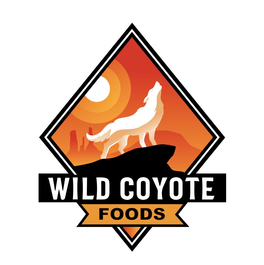
The earlier packaging uses a howling coyote, a prominent brand name and a color band for the flavor. The developed mark keeps the coyote central, placing it within a diamond-shaped desert scene and a strong name banner.

Earlier packaging
Earlier product reference
Starting point
Developed brand mark
Final logo artwork
Identity
03 / Identity exploration

Finding the right
kind of wild.

The alternatives test a central decision: how much character should come from the animal, and how much from the landscape and lettering? A full-body silhouette, a line drawing and a coyote profile offer different balances. Showing those directions makes the thinking behind the developed mark visible.

01 / Coyote & mesaLogo concept
02 / A simpler lineLogo concept
03 / Animal & landscapeLogo concept
Explore the broader logo-development sheet ↗

Original working composition, showing variations in silhouette, lettering, color and badge shape.

04 / Prototypes & label studies

An alternate direction.
A different label language.

This Southwest Ranch wrap was a prototype. It did not go into production. It explores a different label treatment and is shown as development work, separate from the finished product photography above.

Southwest Ranch / Unused wrap-label prototypeUnused prototype
Prototype / Not produced

The illustration-led wrap, product-information panel and bottle rendering belong to this exploratory direction. The finished 25-ounce packaging uses the shared white center band and flavor-color system shown above.

Explore additional label concepts & working presentations ↗

Packaging-development presentations and label studies. These are shown as explorations, separate from the finished product photographs.

Label variations / Concept studiesDevelopment study
Product-range development / PresentationDevelopment study
Label family / Working range studyDevelopment study
Original working label presentationDevelopment study
The delivery

An identity customers
see on the product.

The delivered identity and packaging system spans the complete 12-flavor line, balancing a recognizable brand with clear distinctions between varieties. The three original product photographs show selected applications; the exploratory work documents the other directions considered.

Finished packaging, original identity work and clearly labeled development studies.

Next project / Brand identity · Apparel · WebsiteSt. George Awning