Selected work/Work of Iron
Brand identity / Web design

Work
of Iron.

A visual language for architectural metalwork. From craft-led logo exploration to a refined identity system and website presentation.

My role
Creative direction
Identity system & website creative
The brief
Express metalworking craftsmanship with architectural precision.
The delivery
Developed identity direction
Brand system & website presentations
WEBSITE CONCEPT / DESKTOP, TABLET & MOBILE PRESENTATIONSELECT IMAGE TO EXPLORE
WORK OF IRON / SELECTED WORK
The project
Work of Iron structural identity
Developed identity direction

Craftsmanship,
given a visual language.

The creative challenge was to express both the craft of metalworking and the precision of architectural work. I guided the identity and website direction around that balance, moving from explicit tool-and-badge concepts toward a restrained structural monogram. The supporting system connects that direction across visual assets and digital presentations.

My role

I guided the identity system and website creative, connecting the metalworking craft with an architectural visual language.

The key decision

Move from literal tools and industrial badges toward a compact structural monogram, then carry that architectural direction into the supporting system.

The delivery

A developed identity direction, supporting brand assets and website presentations. The earlier logo explorations show the alternatives considered.

01 / The developed identity

A structural mark.
A more restrained expression.

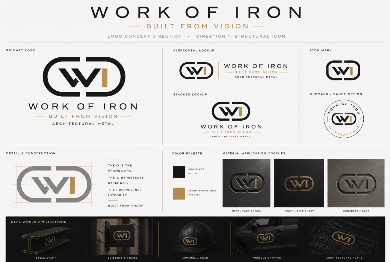
The developed direction combines an enclosing frame, a strong central W and a gold vertical element. The presentation tests the identity as a primary logo, compact icon, stacked lockup and circular submark.

Developed identity direction / Lockups, construction & application studiesIdentity study

Framework & structure

The enclosing form gives the mark a clear boundary, while the central letterforms bring weight and symmetry.

Black & architectural gold

The palette moves between dark surfaces and warm metallic accents, reflected in the material application studies.

A family of formats

Horizontal, stacked and compact versions explore how the identity can adapt to different spaces.

02 / Building the system

The identity is
more than the mark.

The brand-system presentation brings the supporting pieces together: logo assets, service and process icons, color, typography, photographic direction, interface treatments and background graphics.

Brand-system overview / Assets & visual directionSystem study
03 / The digital expression

Let the work
lead the experience.

The website layout extends the identity into a lighter architectural presentation. Project photography leads; service icons, process content and a featured-project gallery support the path toward a consultation.

Website layout / Desktop & responsive presentationDesign presentation
01 / INTRODUCE

Lead with the craft

A large architectural image sets the context for the business.

02 / EXPLAIN

Make services visible

Consistent icons organize the range of metalwork applications.

03 / SHOW

Bring projects forward

A project gallery provides the next layer of visual detail.

04 / CONNECT

Create a next step

The consultation call to action connects inspiration with inquiry.

04 / Exploring the direction

From literal tools
to architectural restraint.

The alternatives make the choice visible: tool-and-badge concepts express the craft literally, while the structural monogram offers a more compact architectural expression. The developed system above carries that restrained direction forward.

  1. 01
    Craft-led symbolsTools and badge forms make the metalworking reference explicit.
  2. 02
    A name with presenceBold lettering gives the full business name a central role.
  3. 03
    An architectural directionThe monogram study introduces a more compact, linear expression.
Four logo directions / Working presentationExploration
The delivery

An architectural identity.
A system to build from.

The developed direction connects the structural monogram with the material palette, service icons and website presentation. The original boards show how that system extends across formats; earlier explorations make the move toward a more restrained architectural expression visible.

Identity studies, brand-application mockups and website design presentations.

Next project / Website · Lead generation · AIAuto Trim Design